
 | ||
Introduction
The Toolbox panel in SCView's Template Editor is a dynamic component located on the left side of the interface that adapts based on the selected template's configuration. The Toolbox behaves differently depending on the Designer type (HTML or Drag and Drop) and Designer Display Mode (Form, Wizard, or PDF). For HTML Designer templates, the Toolbox displays macros that can be copied and pasted into the code editor. For Drag and Drop templates in PDF mode, it provides draggable field controls for the PDF canvas. For Drag and Drop templates in Wizard mode, it offers Default Macro Components that open configuration dialogs when dragged to the design area. This article provides detailed instructions on using the Toolbox panel for all template types in SCView.
A. Problem Statement
Administrators working with the Template Editor Toolbox in SCView often encounter challenges, including:
- Confusion about why the Toolbox displays different options for different templates
- Uncertainty about how to use macros in HTML Designer templates or drag-and-drop field controls in PDF mode
- Difficulty understanding the relationship between Document Types and templates, including switching between multiple assignments
- Not knowing how to configure components or use the configuration dialog options in Wizard mode templates
Without proper knowledge of the Toolbox panel features for each template type, administrators may struggle to add fields and macros to templates or fail to utilize the full capabilities of the Toolbox.
B. Solution
SCView's Template Editor Toolbox provides a context-sensitive interface that adapts to the template configuration. For HTML Designer templates, the Toolbox offers Document Type selection, tab order management, and macro libraries. For Drag and Drop Designer templates with PDF mode, the Toolbox provides Editor Options for visual guides, New Fields for creating form controls, and Doc Type Fields for reusing existing field definitions. For Drag and Drop Designer templates with Wizard mode, the Toolbox offers Default Macro Components that can be dragged to create pre-configured form elements. By understanding how the Toolbox behaves for each configuration, administrators can efficiently design templates using the appropriate tools.
NOTE: Access to the Template Editor requires administrator-level permissions. The Toolbox content depends entirely on the template's Designer and Designer Display Mode configuration set in the Edit Form Template dialog.
Understanding Toolbox Behavior Based on Template Configuration
The Toolbox panel changes its appearance and functionality based on two key settings in the template configuration:
- Designer: HTML or Drag and Drop
- Designer Display Mode: Enhanced Form (for HTML), Form, Wizard, or PDF (for Drag and Drop)
The following sections explain how the Toolbox behaves for each configuration scenario.
Toolbox for HTML Designer Templates
When a form template is configured with Designer: HTML and Designer Display Mode: Enhanced Form, the Toolbox displays macro-based tools for code development.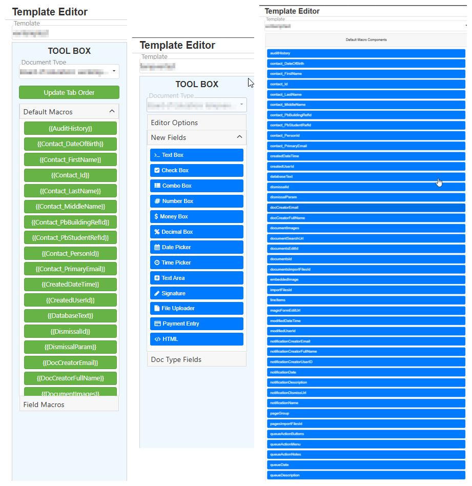
Understanding the HTML Designer Toolbox Layout
Step 1:
Select a template from the Template dropdown that is configured with HTML as the Designer type. The Toolbox will display the HTML specific layout.
Step 2:
Observe the Toolbox components for HTML Designer templates:
Document Type Dropdown: Located at the top of the Toolbox, this dropdown displays the document type(s) assigned to the current template.
Key Features of Document Type Dropdown:
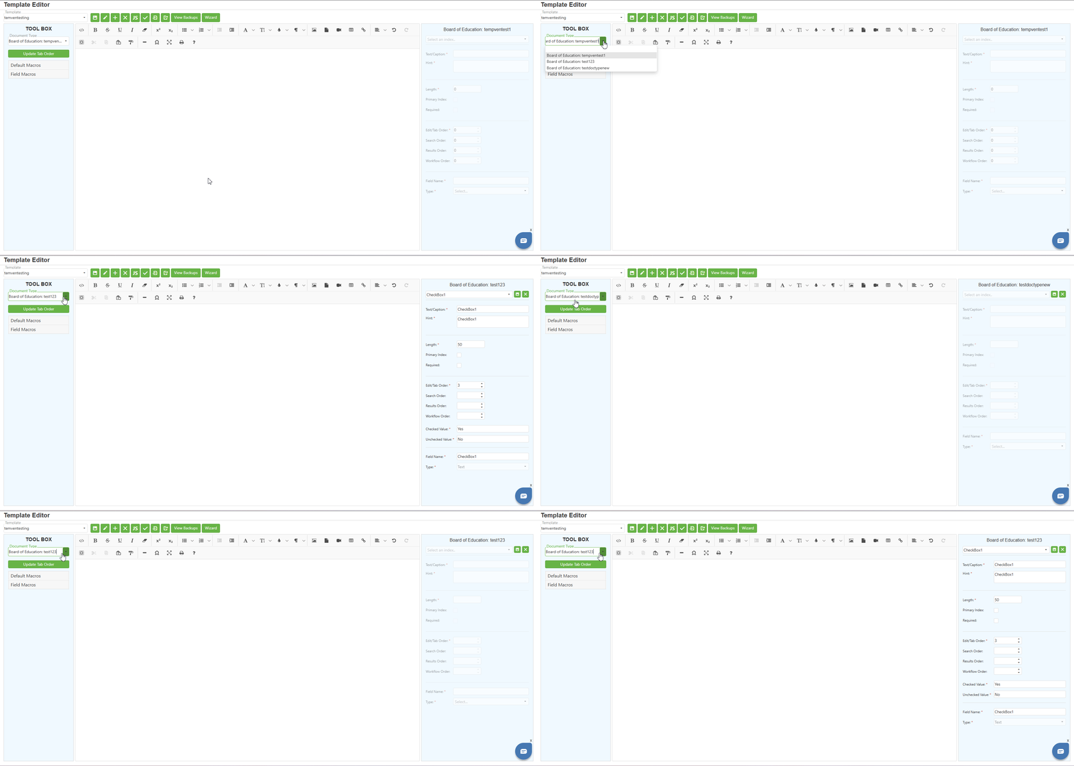
- A single template can be assigned to multiple document types
- You can switch between assigned document types using this dropdown
- Switching document types changes the available Field Macros displayed below
- This allows you to manage one template that serves multiple document types
Step 3:
Locate the "Update Tab Order" button below the Document Type dropdown. This button reorders and updates the tab order for all indexes associated with the current document type. A confirmation dialog will appear before proceeding. Upon confirmation, it successfully saves the template and reorders the indexes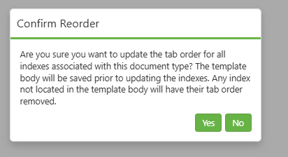
Working with Default Macros
Step 1:
Locate the Default Macros accordion section in the Toolbox. Click on the accordion header to expand or collapse this section.
Step 2:
Review the available default macros displayed as green buttons. Default Macros are pre-built system macros that provide common functionality.
Step 3:
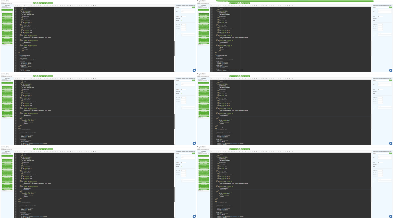
To use a Default Macro:
- Click on the desired macro button in the Toolbox
- The macro text is automatically copied to your clipboard
- Position your cursor in the Design Area (code editor) where you want to insert the macro
- Paste the macro using Ctrl + V or right-click and select Paste
- The macro will be inserted at the cursor position
Working with Field Macros
Step 1:
Locate the Field Macros accordion section in the Toolbox. Click on the accordion header to expand this section.
Step 2:
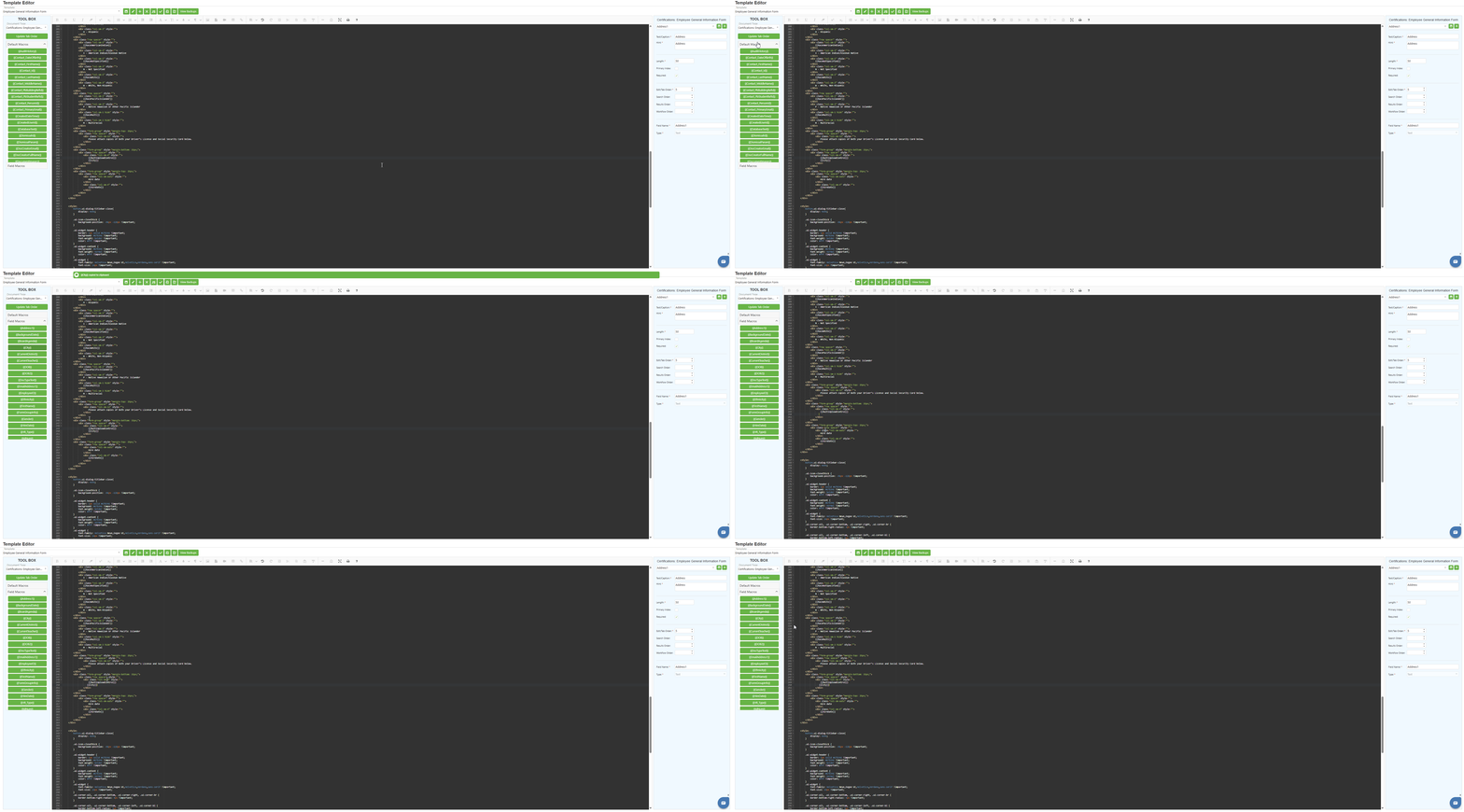
Review the available field macros displayed as green buttons. Field Macros correspond to the index fields defined for the selected Document Type.
Step 3:
To use a Field Macro:
- Click on the desired field macro button in the Toolbox
- The macro text is automatically copied to your clipboard
- Position your cursor in the Design Area (code editor) where you want to insert the macro
- Paste the macro using Ctrl + V or right-click and select Paste
- The macro will render as a form field when the form is displayed to users
Step 4:
Remember that Field Macros change based on the Document Type selected in the Document Type dropdown. If your template is assigned to multiple document types, switch between them to access different field macros.
Toolbox for Drag and Drop Designer (PDF Mode)
When a form template is configured with Designer: Drag and Drop and Designer Display Mode: PDF, and a PDF document has been uploaded, the Toolbox displays drag-and-drop field controls for visual form design.
Understanding the Drag and Drop PDF Toolbox Layout
Step 1:
Create or edit a template with the following configuration:
- Designer: Drag and Drop
- Designer Display Mode: PDF
- Document Type: New or Existing (with Department and Doc Type Name configured)
- Assign Form: Checked
- Upload a PDF document using the "Browse for PDF.." button
Step 2:
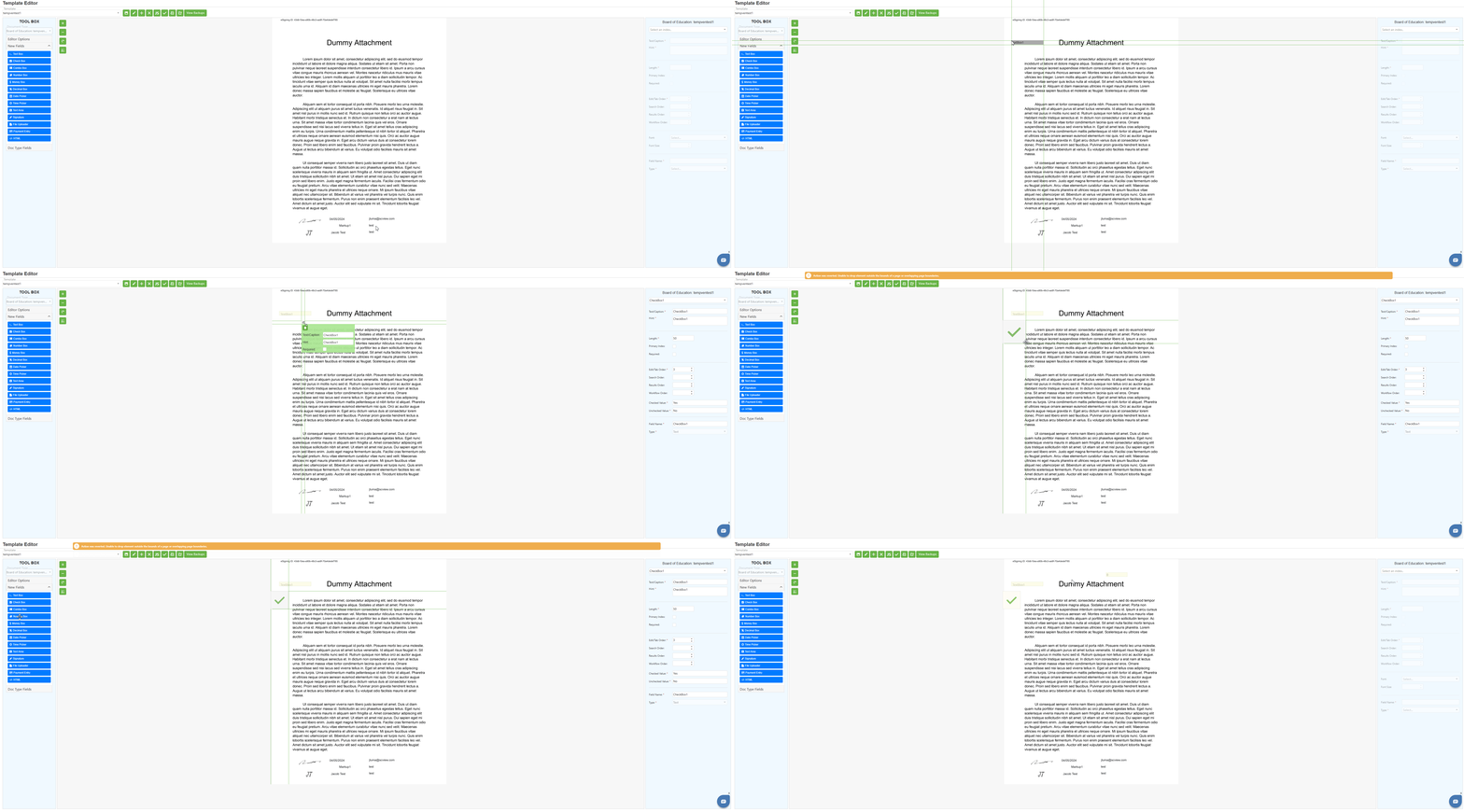
Once configured, the Toolbox will display the drag-and-drop specific layout:
Step 3:
Observe the Toolbox components for Drag and Drop PDF templates:
Document Type Dropdown: Displays the document type assigned to the template. This shows which document type the template is assigned to.
Editor Options Accordion: Contains visual design aids and display settings for the canvas.
New Fields Accordion: Contains draggable field controls for creating new form fields.
Doc Type Fields Accordion: Contains existing fields already defined for the document type.
Working with Editor Options
Step 1:
Expand the Editor Options accordion section to access visual design settings.
Step 2:
Configure the available Editor Options:
- Show Selected Crosshairs: When checked, displays crosshair guides when a field is selected on the canvas, helping with precise positioning
- Show Control Headers: When checked, displays header labels on field controls for easy identification
- Show Field Name: Radio button option to display the internal field name on controls
- Show Text/Caption: Radio button option to display the user-facing text caption on controls
- Show Edit/Tab Order: When checked, displays the tab order numbers on fields for navigation reference
Step 3:
Toggle these options as needed while designing your form. These visual aids help with precise field placement and organization but do not affect the final form appearance for end users.
Working with New Fields
Step 1:
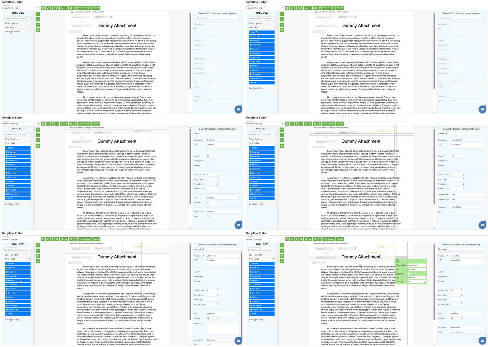
Expand the New Fields accordion section to access the draggable field controls.
Step 2:
Review the available field types displayed as blue buttons:
- Text Box – Creates a single-line text input field for short text entries
- Check Box – Creates a checkbox for boolean yes/no or true/false selections
- Combo Box – Creates a dropdown selection field with predefined options
- Number Box – Creates a numeric input field that accepts only numbers
- Money Box – Creates a currency input field with monetary formatting
- Decimal Box – Creates a decimal number input field for precise numeric values
- Date Picker – Creates a date selection field with a calendar interface
- Time Picker – Creates a time selection field for time input
- Text Area – Creates a multi-line text input field for longer text entries
- Signature – Creates a signature capture field for electronic signatures
- File Uploader – Creates a file attachment field for uploading documents
- Payment Entry – Creates a payment information entry field
- HTML – Creates a custom HTML content block for static content or advanced formatting
Step 3:
To add a new field to the form:
- Click and hold on the desired field type button in the Toolbox
- Drag the field onto the PDF canvas in the Design Area
- Release the mouse button to place the field at the desired location
- The field will appear on the canvas and can be repositioned or resized
Step 4:
After placing a field, use the resize handles (small squares on corners and edges) to adjust the field size to match the corresponding area on the PDF form.
Step 5:
Configure the field properties using the Properties Container on the right side of the interface. Set the Text/Caption, Field Name, Type, and other properties as needed.
Working with Doc Type Fields
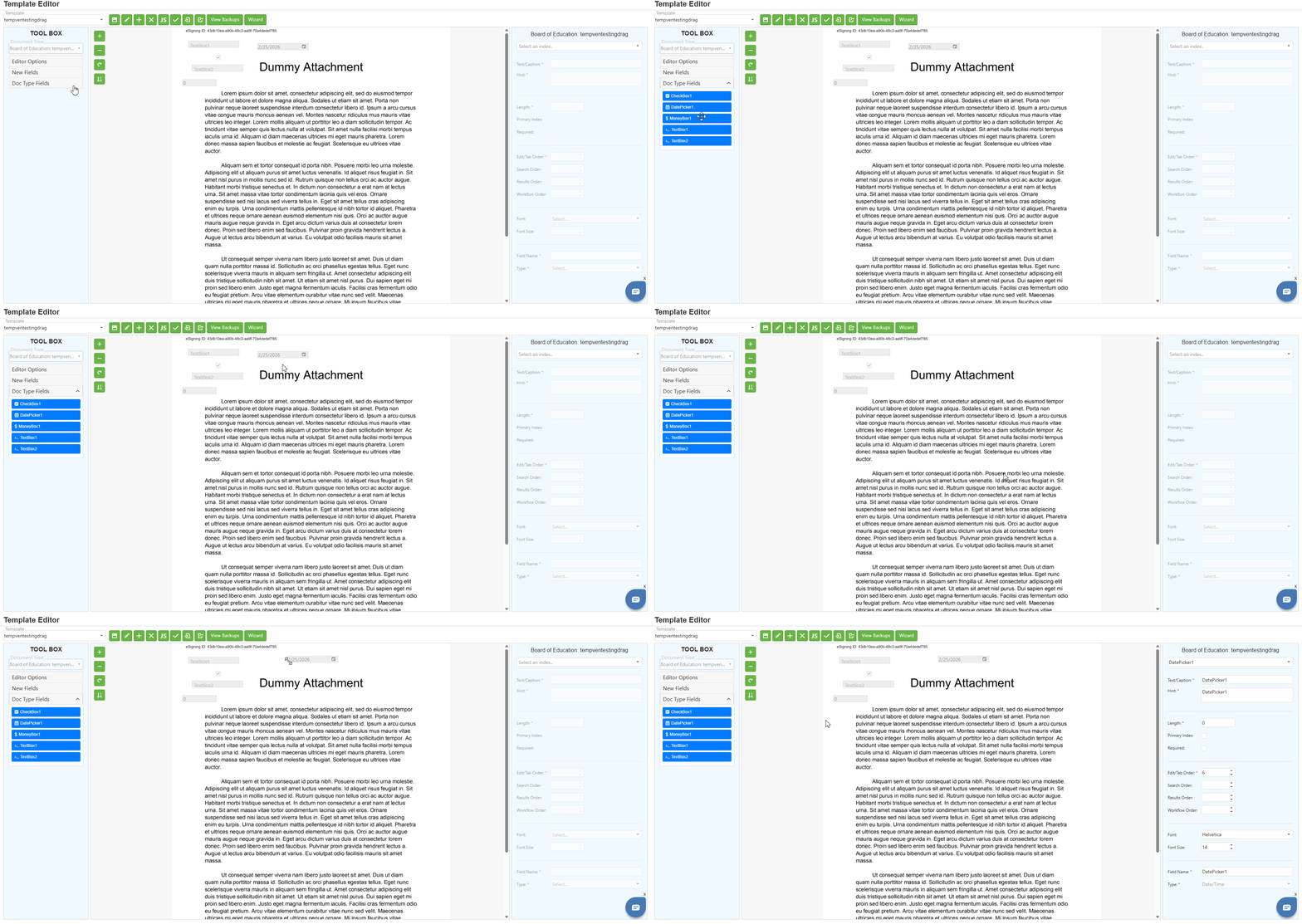
The Doc Type Fields section serves as a repository of existing fields defined for the document type. These fields can be reused as needed.
Understanding Doc Type Fields Behavior
a) Initial State:
- When working with a new or existing template, the fields displayed in the Doc Type Fields section are for reference only.
- Initially, you cannot drag and drop these fields directly onto the PDF canvas in the Design Area.
b) After Field Deletion:
- When a field is deleted from the PDF canvas, it becomes available for reuse in the Doc Type Fields section.
- These deleted fields can be dragged and dropped back onto the PDF canvas in the Design Area when needed in the future.
Toolbox for Drag and Drop Designer (Wizard Mode)
When a form template is configured with Designer: Drag and Drop and Designer Display Mode: Wizard, the Toolbox displays Default Macro Components that create pre-configured form elements through a configuration dialog.
Understanding the Wizard Mode Toolbox Layout
Step 1:
Create or edit a template with the following configuration:
- Designer: Drag and Drop
- Designer Display Mode: Wizard
- Document Type: Configured as needed
Step 2:
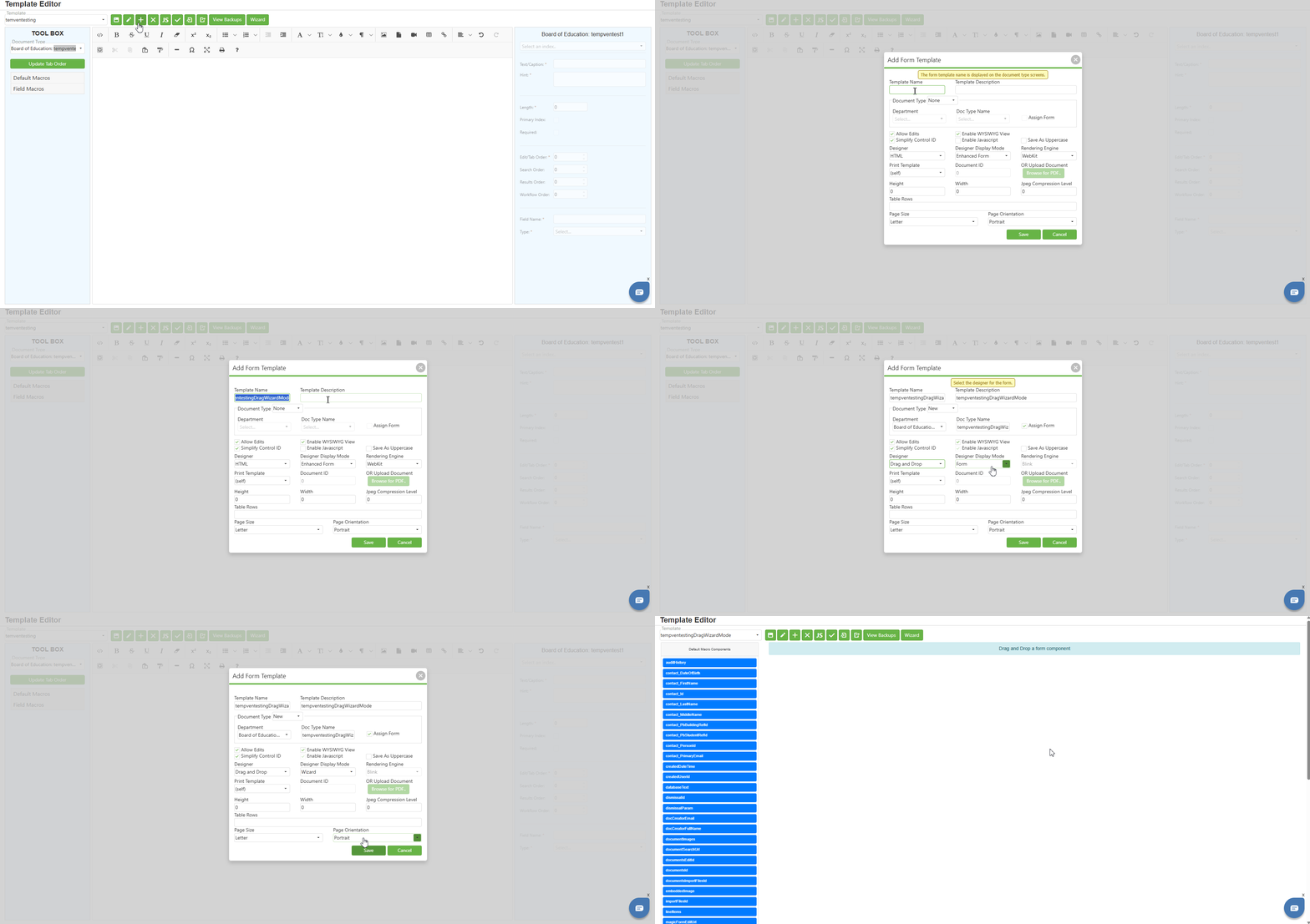
Once configured, the Toolbox will display the Wizard-specific layout:
Step 3:
Observe the Toolbox components for Wizard Mode templates:
Default Macro Components:
The Toolbox displays a list of default macro components as blue buttons. These components are pre-built form elements that can be dragged to the Design Area to create configured form fields.
Available Default Macro Components include:
- auditHistory – Audit history display component
- contact_DateOfBirth – Date of birth input component
- contact_FirstName – First name input component
- contact_Id – Contact ID component
- contact_LastName – Last name input component
- contact_MiddleName – Middle name input component
- contact_PbBuildingRefId – Building reference component
- contact_PbStudentRefId – Student reference component
- contact_PersonId – Person ID component
- contact_PrimaryEmail – Primary email component
- createdDateTime – Created date/time component
- createdUserId – Created user ID component
- databaseText – Database text component
- dismissalId – Dismissal ID component
- dismissalParam – Dismissal parameter component
- docCreatorEmail – Document creator email component
- docCreatorFullName – Document creator full name component
- documentImages – Document images component
- documentSearchUrl – Document search URL component
- documentsEditId – Documents edit ID component
- documentsId – Documents ID component
And many more system components
Working with Default Macro Components (Wizard Mode)
Step 1:
Locate the desired component in the Default Macro Components list.
Step 2:
Click and hold on the component button, then drag it to the Design Area.
Step 3:
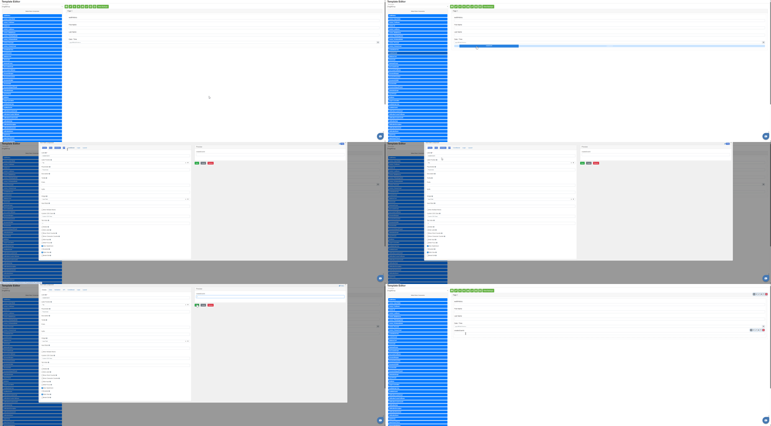
When you release the component in the Design Area, a Component Configuration Dialog will automatically open. This dialog allows you to configure the component before it is added to the form.
Step 4:
The Component Configuration Dialog contains multiple tabs for comprehensive field configuration:
Display Tab: Configure display specific settings such as label position, placeholder and default values
Date Tab (for date components): Configure date-specific settings such as date range restrictions and default values.
Time Tab (for time components): Configure time-specific settings such as time format and restrictions.
Data Tab: Configure data binding and default value settings.
Validation Tab: Configure validation rules such as required fields, minimum/maximum values, and custom validation.
API Tab: Configure API-related settings for data integration.
Conditional Tab: Configure conditional logic for showing/hiding or enabling/disabling the field.
Logic Tab: Configure advanced logic and calculations.
Layout Tab: Configure layout and positioning settings.
Step 5:
On the right side of the dialog, the Preview section displays a live preview of how the component will appear based on your configuration.
Step 6:
After configuring all required settings:
- Click "Save" to add the configured component to the Design Area
- Click "Cancel" to discard changes and close the dialog without adding the component
- Click "Remove" to remove an existing component
Step 7:
Once saved, the component appears in the Design Area with the configured label and settings. The Design Area displays the form layout with all added components.
Multiple Document Type Assignment
Understanding Template-to-Document Type Relationships
A single template can be assigned to multiple document types. This is useful when the same form structure is used across different departments or categories.
Behavior Based on Template Type
a) For HTML Templates:
- When an HTML template has multiple document type assignments, the Document Type dropdown in the Toolbox allows you to switch between them.
- The available Field Macros change dynamically to reflect the selected document type's fields.
b) For Drag and Drop Templates:
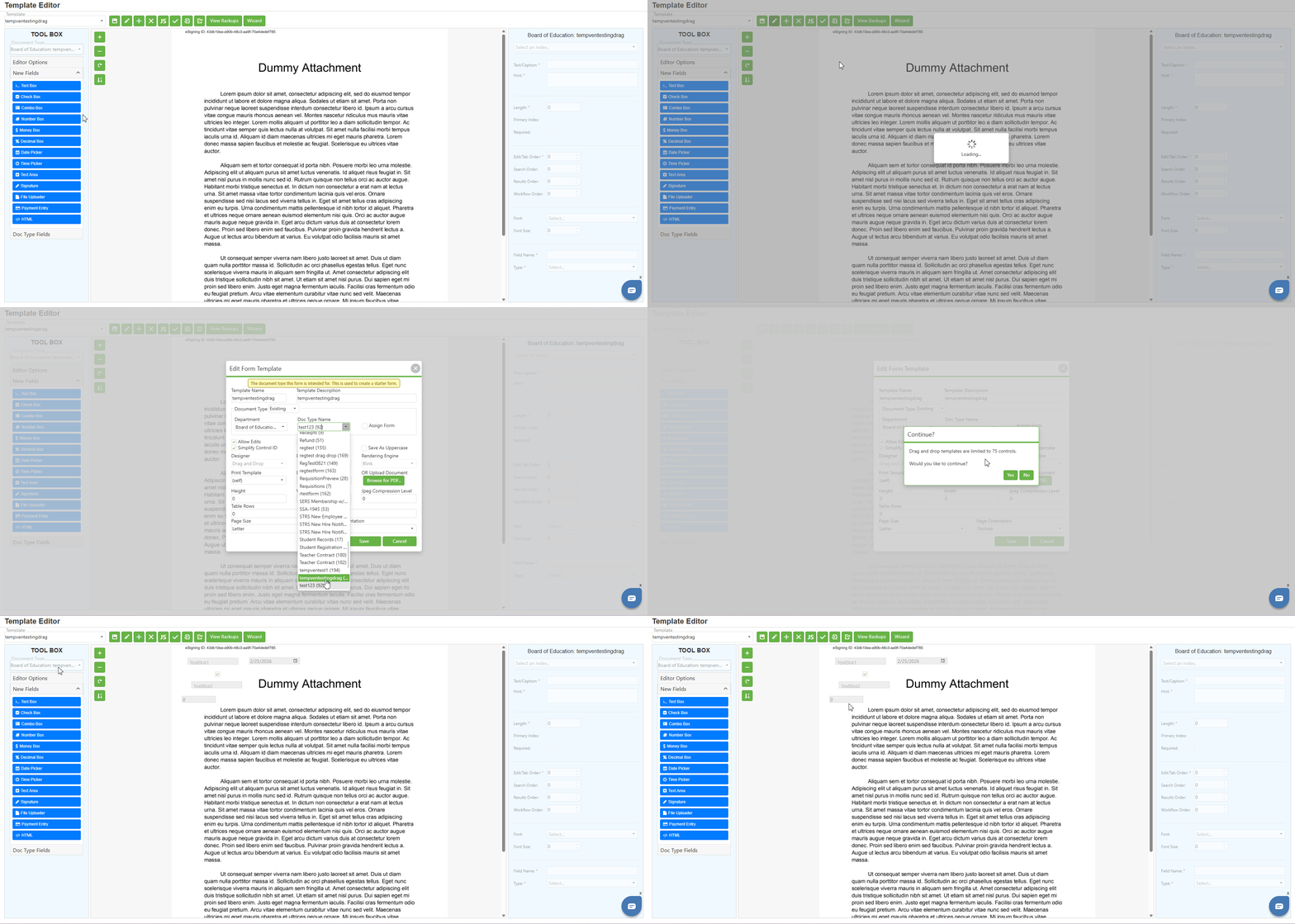
- The Document Type dropdown in the Toolbox is disabled and displays the assigned document type name in the disabled field.
- The available Doc Type Fields reflect the selected document type's existing fields.
Changing Document Type for Drag and Drop Templates
To change the document type assignment for Drag and Drop templates:
- Open the Edit Form Template dialog.
- Configure the Document Type settings using the existing options.
- Save the changes.
Note: You must know the exact document type names, as this is the only method to change document type assignments for Drag and Drop templates.
C. Best Practices
HTML Designer Toolbox
- Use Field Macros for searchable, indexed fields and Default Macros for system information or display-only content; organize macros logically for maintainability
- Always verify the correct Document Type is selected before inserting Field Macros; use the Update Tab Order button to reorder indexes after making changes
Drag and Drop PDF Toolbox
- Enable Show Selected Crosshairs and Show Edit/Tab Order during design for precise placement; match field sizes to corresponding areas on the PDF form
- Use Doc Type Fields when possible to maintain data consistency; create New Fields only when needed and set meaningful Field Names and Text/Captions
Drag and Drop Wizard Toolbox
- Configure all required fields in the Component Configuration Dialog and use the Preview section to verify appearance before saving
- Set appropriate validation rules, configure conditional logic for dynamic forms, and use consistent label positions for a professional appearance
Document Type Management
- Plan document type assignments before creating templates and keep track of templates assigned to multiple document types
- Use the Document Type dropdown to verify field availability and test templates for each assigned document type
General Toolbox
- Familiarize yourself with the different Toolbox layouts for each template configuration; use Editor Options to assist with visual design tasks
- Collapse unused accordion sections to reduce clutter and save your work frequently after adding fields or components
D. Troubleshooting
- Toolbox not displaying expected content: Verify the template's Designer and Designer Display Mode settings in Edit Form Template; refresh the page and reselect the template
- Macros not copying to clipboard: Click directly on the macro button and paste immediately; check browser permissions for clipboard access or try a different browser
- Field Macros not appearing: Verify a Document Type is assigned to the template, check the Document Type dropdown selection, and expand the Field Macros accordion section
- Unable to drag fields to canvas: Verify the template is configured as Drag and Drop with PDF mode and ensure a PDF document has been uploaded; refresh and try again
- Doc Type Fields section empty: Verify fields have been created for the Document Type and check the Document Type dropdown selection
- Component Configuration Dialog not opening (Wizard Mode): Verify the template is configured with Designer Display Mode: Wizard and ensure you are dragging the component to the Design Area; refresh and try again
- Component not saving from Configuration Dialog: Ensure all required fields (marked with *) are completed, verify the Label field is not empty, and check for validation errors
- Editor Options not affecting canvas display: Ensure checkboxes are properly checked; note that options affect the editor view only, not the final form; try toggling options or refreshing the page
- Document Type dropdown not showing all assignments: Verify all document type assignments were saved properly in Edit Form Template; refresh the Toolbox by reselecting the template
E. Related Articles
Template Editor: Properties Container
Conclusion
The Toolbox panel in SCView's Template Editor adapts based on the template's configuration, supporting three primary modes: HTML Designer with copyable Default and Field Macros and tab order management, Drag and Drop PDF mode with draggable field controls and visual design aids for uploaded documents, and Drag and Drop Wizard mode with component configuration dialogs and comprehensive settings. Understanding how to use the Toolbox for each template type is essential for efficient template design. By following the best practices and troubleshooting guidance in this article, administrators can maximize productivity when working with form templates in SCView.